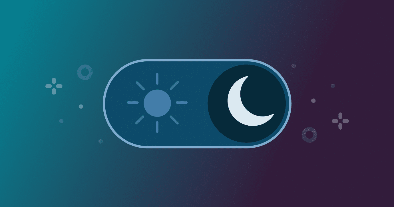
Dark mode in email design is a necessity today. Apps should allow customers to switch between light and dark mode emails depending on their preference. The only thing to ensure is that the email design for dark mode should appear as professional as it does in light mode.
A report by Pathwire and Ascend2 suggests that around 44% of marketers consider dark mode for email production. However, the only challenge remains that dark mode for emails is handled differently.
This guide aims to provide information on what actually works for dark mode email marketing.
What is Dark Mode in Email?
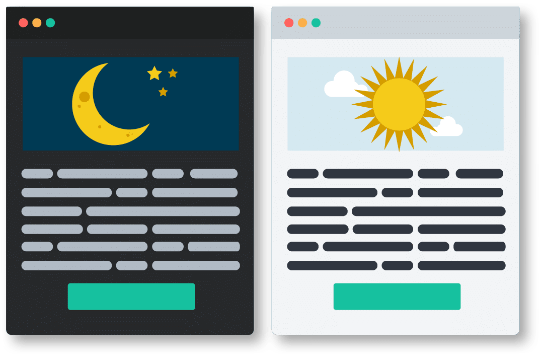
Dark mode email design refers to a darker color palette for low-light designs, suitable for the night environment. It follows a reversed color scheme using light-colored typography, icons on the dark background, and various UI elements to enhance readability.
Many popular platforms such as Facebook, Slack, and X (formerly Twitter) now allow users to switch to dark mode. Most people these days prefer dark mode emails and other templates because it is lighter on the eyes and lowers the screen brightness, which further helps to save battery life.
Dark Mode Email Design Best Practices
Email design for dark mode requires integrating elements that do not require a lot of modifications. The foundation lies in avoiding aggressive color inversions.
Below are some of the key practices for designing dark mode email templates:
Design with Minimal Backgrounds
For your email design, make sure to use minimal or transparent background colors. Having simple designs helps with faster adaptations when inverting backgrounds, compared to complex ones.
Do not use large colored backgrounds, or else they may invert into different colors. Moreover, to create a visual separation, it is advisable to use borders, whitespace, and subtle shadows. All these minimalistic approaches should be aligned with your brand reputation.
Have a Mobile-first Design
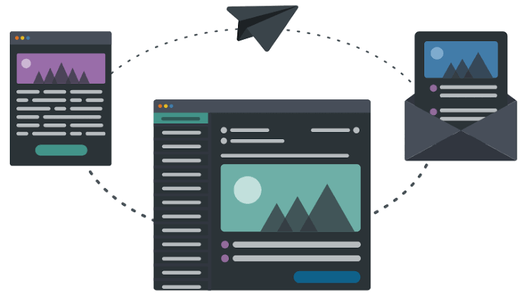
The email design for dark mode must have a mobile-first approach. This is because the emails in dark mode are first opened on mobile devices. Integrate single-column layouts so they can easily work on any screen size. This is a clear strategy to boost customer experience and drive engagement.
Have fewer visually competing elements for better adaptation. Once the design is ready, make sure to check it on your respective devices. Do not rely on email preview, as it may not provide an exact idea of what the customers would see.
Maintain Visual Hierarchy
Always work towards maintaining visual hierarchy in email templates, which should be clear in light and dark modes. Create a structure using spacing, weights, and font sizes and, not just colors. The headings should be larger and bolder so that they remain distinct even when the color changes.
Once the visual hierarchy elements are integrated, view them in grayscale. If you can figure out the details without color, it will sustain against dark mode. Set up the foundation principles so that it helps in image optimizations as well.
Maintain Contrast Ratios
Oftentimes, dark mode email designs fail because of the contrast ratios. In such cases, it is extremely crucial to use contrast ratios against the background for building readability. For the body text, the contrast ratio should be around 4.5:1, whereas for the large text, it should be around 3:1.
Test the color combinations and ensure that they stand out well in dark as well as light modes. Don’t assume that the dark mode email templates would work for light modes and vice versa. Therefore, test every color across all the modes.
Integrate Transparent PNG Images
For dark mode email design, save the icons and logos as PNGs rather than JPEGs with white backgrounds. The transparent background easily adapts automatically when the surrounding background color is changed.
Having a white background for these elements means that when the background is changed, the color will remain. Having a transparent logo means that it can easily work on any background color. However, ensure that the edges are clean, and there’s no white halo, which may show up against the dark background.
Common Dark Mode Email Design Mistakes
Make sure to monitor the email marketing tactics regularly to avoid any design mistakes. However, when integrating dark mode, there are some mistakes that may happen, such as the following:
- Choosing low-contrast colors: Buttons, icons, and text may become difficult to read in dark mode. With the help of Stripo, you get flexible dark mode email design controls. This helps in maintaining visual consistency and better contrast.
- Using transparent images without testing: Logos and graphics that have transparent backgrounds can disappear against dark backgrounds. Make sure to test so that you can preview and adjust the elements as and when required.
- Ignoring email signatures: When not done correctly, the signatures can either appear unreadable or poorly aligned in dark mode. It is advisable to use one of the best email signature generators that can help create responsive and clean signatures.
Conclusion
Dark mode email marketing requires testing, planning, and iterations. Make sure to thoroughly audit all your current email templates. Once the design is ready, test it on your phone and identify any potential problems that may exist. Send the email across multiple devices and even use testing services to check how it works across every platform. Better readability in emails drives engagement, and doing email design for dark mode correctly helps to do that.
Published: September 30, 2026