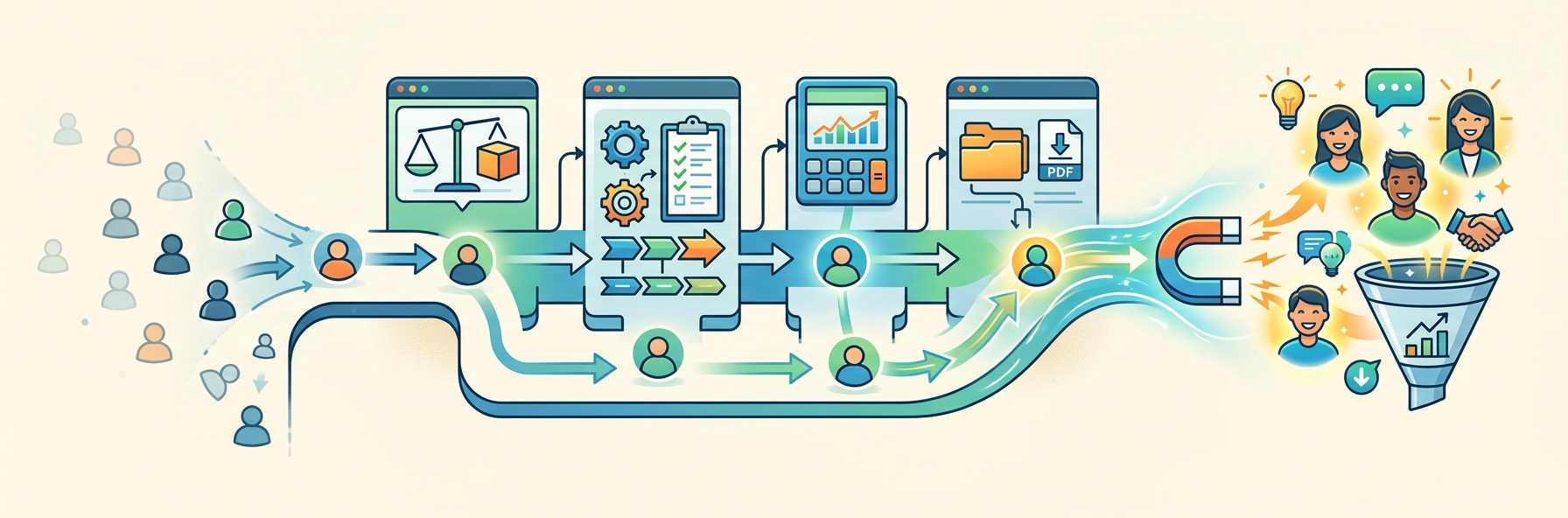
Practical Ways to Turn Website Visitors Into Engaged Prospects
Does your website feel like it has a leak? People arrive, look around for a few seconds, then disappear before they have a reason to take the next step.
Someone lands on your homepage, scrolls for eleven seconds, and vanishes into whatever browser tab catches their attention next. You’ll never know their name, their budget, or how close they came to contacting you.
Most businesses respond to this by chasing more traffic. But the real fix is on the page itself. A few sharp, well-placed adjustments in your layout, your messaging, and your timing can catch people mid-scroll and give them a reason to stay.
This article breaks down exactly which adjustments work, and why they turn lookers into leads.
Give Visitors Conversion Paths That Match Their Purchase Intent
Not every visitor lands on your site ready to buy, and treating them all the same wastes both their time and your traffic. Someone comparing options needs a different next step than someone who already knows what they want.
-
Comparison content helps people weigh alternatives side by side.
-
Buyer guides walk newer shoppers through unfamiliar decisions.
-
Category pages let visitors browse and narrow down naturally.
-
Direct product pages serve people who’ve already made up their minds and just need a fast path to checkout.
When you offer only one route forward, usually a single “Buy Now” button, you push early-stage visitors toward a decision they’re not ready to make, and they leave instead of converting later.
To apply this method:
-
Organize your content according to the stages of your audience’s journey.
-
Create comparison articles for situations where there are several valid choices.
-
Develop short guides that answer the “How do I choose?” questions customers ask before they make a purchase.
-
Connect these articles to the appropriate products.
This ensures that the transition from research to buying is a logical step rather than a sudden change.
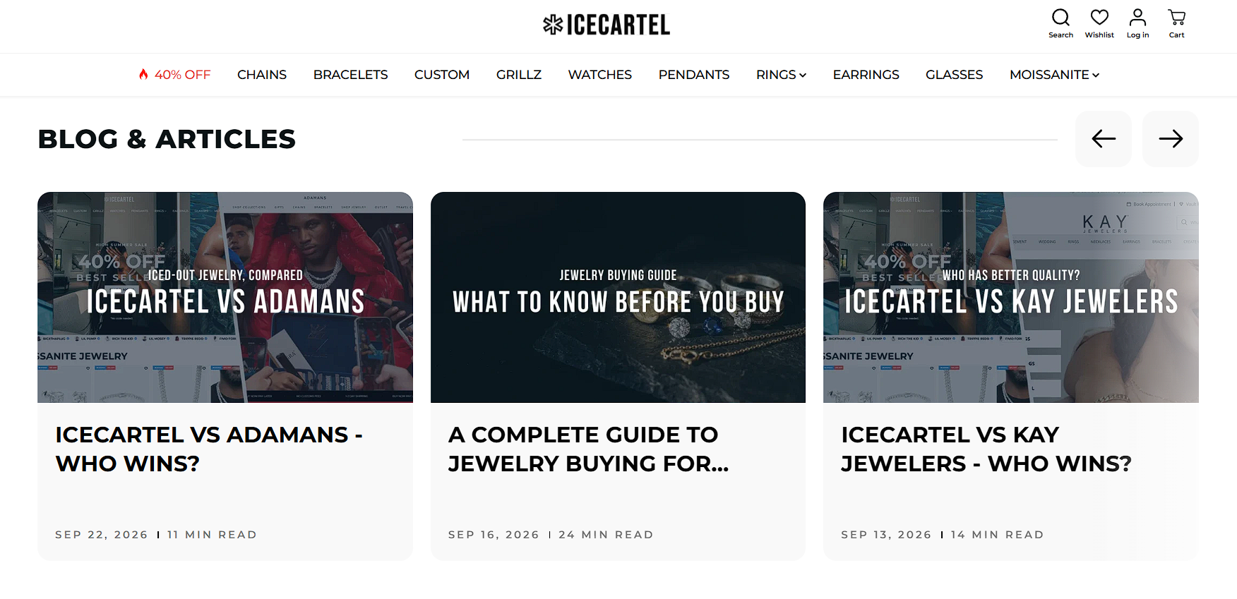
An example of a brand that uses this approach is Icecartel, a jewelry brand specializing in men’s moissanite pieces.
Instead of pointing every visitor straight to a product page, the site runs head-to-head comparisons against other jewelers and publishes buying guides on choosing chains, rings, and gemstones.
A shopper who’s still deciding between moissanite and other stones gets educational content that builds confidence, while someone ready to buy finds direct links into the shop from those same guides.
Answer Key Buying Questions Before Asking for an Inquiry
Asking someone to fill out a contact form is a bigger task than it looks. Before people commit to reaching out, they want to know what they’re getting into. They’re interested in quantity requirements, how long production takes, what sizing options exist, what customization involves, and what actually happens after they hit “Submit”.
When a site leaves these questions unanswered, visitors either abandon the page or send in vague, low-quality inquiries that waste everyone’s time.
Baymard Institute’s usability testing backs this up in a related context. Shoppers who couldn’t find clear sizing details on apparel sites often gave up on items they wanted, simply because they couldn’t confirm the fit. The same hesitation applies anywhere a purchase decision depends on details the page doesn’t provide.
To fix this:
-
List your practical details in plain sight, not buried in an FAQ three clicks deep.
-
State your minimums, your typical timeline, and what customers need to prepare before reaching out.
-
Walk through what the process looks like from first contact to delivery, so nobody’s guessing what comes next.
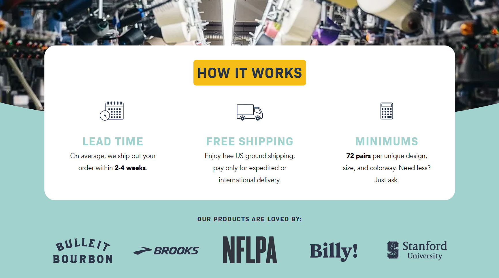
Custom Sock Lab, a producer of custom socks for businesses and individual buyers, handles this by laying out its entire ordering process in clear steps right on its site.
Each step gets a plain-language explanation paired with a simple visual, covering everything from lead times to minimum order sizes to shipping.
This way, a first-time visitor can scan the whole process in under a minute and understand exactly what starting a project involves, before they ever reach out.
Use Interactive Tools to Turn Technical Research Into Product Interest
Some visitors don’t need convincing. They’re already past that point. They know they want a product, but they’re stuck on a technical question. What size fits my setup? What specs are compatible with my device? What number should I be looking for?
Calculators, sizing tools, and compatibility checkers solve exactly this problem. They take a measurement or a specification the visitor already has and translate it into a clear, actionable answer (this size, this part, this option, etc.).
That’s different from general educational content, which builds understanding over time. A technical tool solves one specific decision on the spot, right when the visitor needs it. It keeps them moving toward a purchase instead of sending them off to search elsewhere for the answer.
To build this into your own site:
-
Start with the specific decisions your customers get stuck on.
-
If sizing or compatibility questions show up often in support requests, that’s a sign a calculator or lookup tool would help.
-
Keep the tool simple and focused on one input and one clear output.
-
Place it right next to the products it applies to.
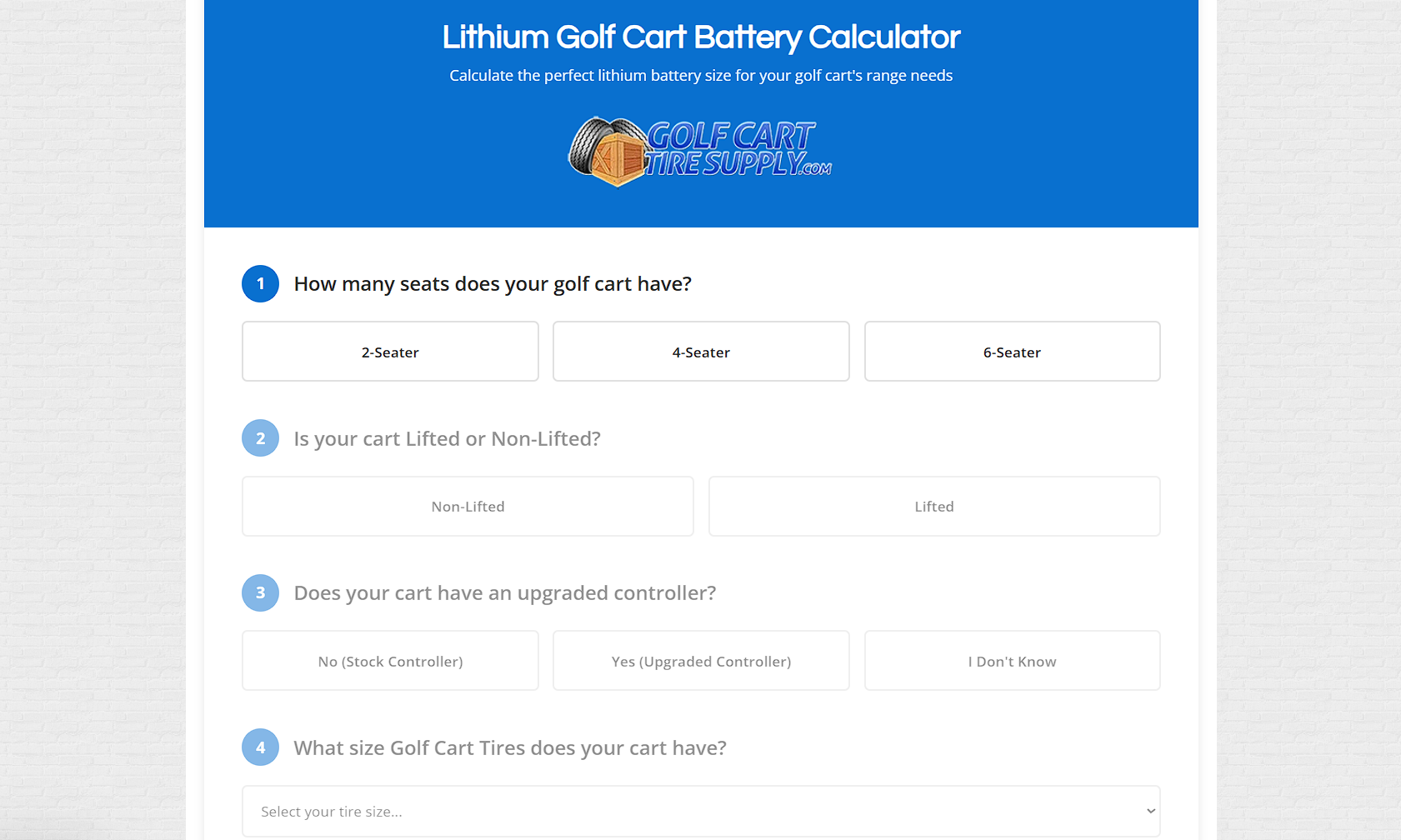
Golf Cart Tire Supply, which sells tires and accessories for golf carts, builds several of these tools directly into its site.
It offers a lithium battery calculator, tire and wheel size explainers that break down confusing measurement codes, and lookup pages that help customers identify their exact cart model by year and serial number.
Someone unsure what tire size fits their lifted cart can find the answer directly, then move straight to the matching product without leaving to search elsewhere.
Reduce Uncertainty Around High-Consideration Purchases
Big purchases carry big questions. Before someone commits to a major project, whether it’s a home addition, a piece of custom equipment, or anything with a four-figure price tag, they want to know what it costs, what installing or setting it up involves, how large a scope they’re taking on, and what the finished result will actually look like.
Vague answers to these questions stall visitors at the research stage. Pairing educational content with transparent starting prices and genuine project examples gives early-stage visitors enough to work with, turning a hesitant browser into someone ready to engage further.
A survey of more than 6,000 U.S. homeowners found that two of the top factors that would have improved their experience working with a professional were clearer pricing and a better sense of what the finished result would look like.
To implement this:
-
Publish starting prices even if your final cost varies by project, and explain plainly what drives that variation.
-
Add a gallery of completed work with enough detail (such as sizes, materials, and location) that visitors can picture their own version of the project.
-
Write short guides addressing the practical questions people ask before committing, like installation time or site requirements.
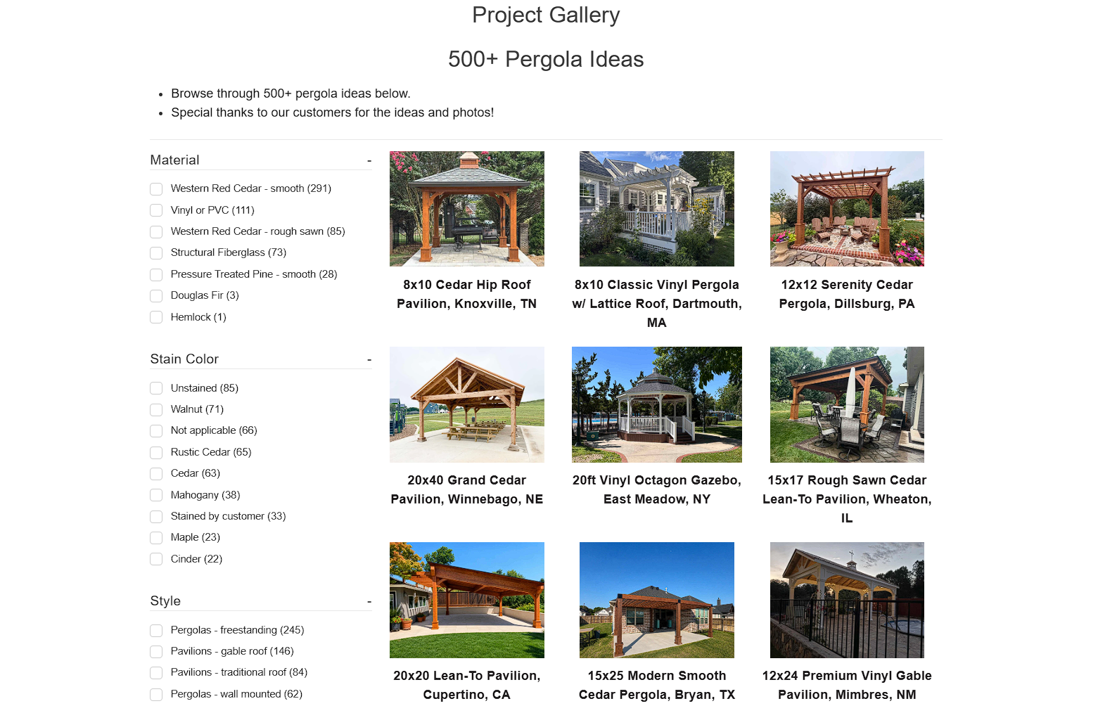
Pergola Kits USA, a manufacturer and installer of pergolas and patio kits, applies this thoroughly.
Its site lists starting prices for each structure alongside square footage guidance that explains how cost scales with size. A large project gallery showcases real customer installations, complete with dimensions, materials, and locations.
This allows visitors comparing options to see exactly what a similar structure looks like in a real backyard before requesting a quote.
Offer Useful Resources Visitors Can Take with Them
Not every visitor is ready to buy or inquire on their first visit, but that doesn’t mean they’re a dead end. A downloadable checklist, planning template, or reference guide gives them something to do in the meantime. It helps them solve a real problem they’re currently facing, whether that’s planning a project, comparing options, or organizing information they’d otherwise have to piece together themselves.
The resource has to earn its download on its own merit. If it’s thin or clearly built just to capture an email address, visitors notice, and the goodwill you were hoping to build disappears.
A genuinely useful resource, on the other hand, gives people a reason to keep your brand in view long after they’ve closed the tab, since they’ll likely return to it, and to you, when they’re ready to act.
To leverage this tactic:
-
Find a stage in your customer’s decision-making process where they must compare, plan, or organize information.
-
Create a resource that helps them complete that specific task.
-
Ensure the content is detailed enough to be useful on its own rather than acting as an advertisement for your services.
-
Make the resource easy to find and don’t require users to fill out long forms to access it.
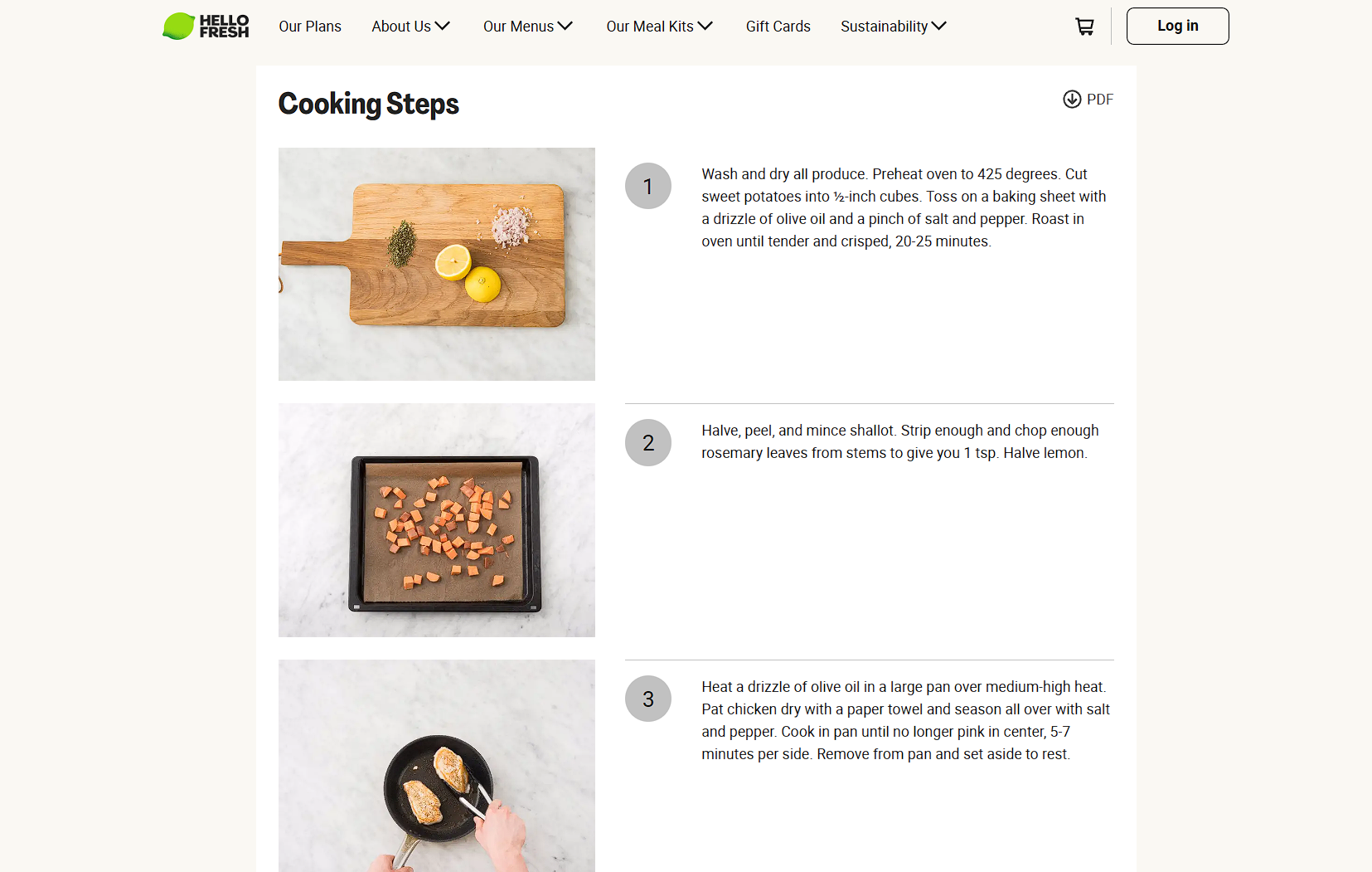
HelloFresh, a subscription service that delivers pre-portioned ingredients for weekly home-cooked meals, applies this idea on a large scale.
Its site offers a library of more than 10,000 recipes, each downloadable as a PDF, so visitors can save or print them without needing to search the site again later. That way, someone who isn’t ready to subscribe can still walk away with something they’ll actually use.
This makes customers associate the brand with practical value rather than just shallow marketing.
Final Thoughts
Somewhere on your site right now, a visitor is one tab away from leaving with a question you could’ve answered in a sentence. Not because they weren’t interested, but because nobody thought to answer it before they had to ask.
That’s the entire point of this post. Every tactic here amounts to the same move – catching a question before it becomes an exit.
A tire size, a starting price, a step in a process nobody explained. None of it is glamorous. Most of it won’t show up in a case study. But it’s the difference between a visitor who leaves to “think about it” and one who stays because the site already thought about it for them.
So, go find that question your site isn’t answering yet.
Published: October 2, 2026