Smart Ways to Make Your Website Work Harder for Your Brand
Your website has a job to do every day. It should help people understand your brand, answer their questions, build confidence, and move them toward a useful next step.
When it does those things well, it becomes a reliable part of your marketing instead of a digital brochure that sits quietly in the background.
That performance comes from hundreds of small decisions. A visitor should know where to go next. Product pages should make important details easy to find. Information should feel timely and relevant. Helpful tools can resolve questions that might otherwise send shoppers to Google. Even small improvements to page structure or messaging can change how people interact with your site.
The smartest approach starts with what visitors need and connects those needs to clear business goals.
Here are some smart ways to make your website work harder for your brand.
Let Visitors Complete Useful Tasks on the Website
A website becomes more useful when visitors can complete part of a task themselves. Searchable databases, filters, directories, comparison tools, calculators, eligibility checkers, and compatibility finders can turn a visit into practical progress.
These functions shorten the route from arrival to a useful result. The strongest tools focus on one task and remove unnecessary steps. A shopper can narrow products by specifications, compare options, or calculate what they need without leaving the site. Someone searching for a service can filter providers by location, category, or requirements.
Start with decisions that send customers to search engines, spreadsheets, or calculations, then build functionality that handles those decisions on your website.
- Identify one or two tasks that create friction for visitors.
- List the information they need, remove unnecessary fields, and use labels that match customer language.
- Choose filters around real selection criteria, make search forgiving, and show calculator results immediately.
- Test the tool with real users, then monitor searches, filter use, completion rates, and drop-offs.
- Improve confusing fields and weak results based on those behaviors. A useful self-service function should save time and produce a result people can use right away online.
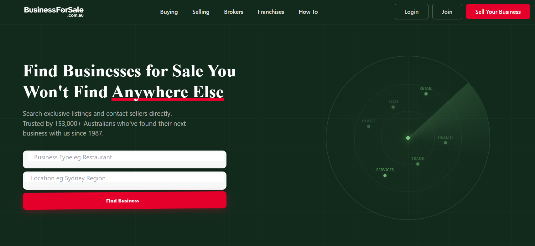
A brand that shows this tactic in practice is Business For Sale, an Australian platform specializing in listings for businesses and franchises.
Its homepage places a search tool in the header, with fields for business type and location, so prospective buyers can look for opportunities. This allows them to begin the search without exploring the site. The site organizes listings by location and industry, giving users ways to navigate opportunities based on what they want to find.
This setup helps people with an objective start immediately.
Answer the Questions People Ask Before Hiring You
Prospective customers hesitate to reach out when a service feels like a mystery. Service pages that spell out how the process works, what to expect at each stage, and what separates a strong provider from a weak one give visitors the confidence to move forward.
This means explaining timelines, walking through what a typical engagement looks like, and naming the factors worth comparing between providers. It also means anticipating the exact questions someone would ask during a phone call and answering them directly on the page.
When a website handles this evaluation work upfront, visitors don’t need to leave and search elsewhere for reassurance. They get everything needed to decide right there.
- List every question you’d expect during a first consultation call.
- Turn each one into a short, clear section on your service page.
- Include a rough outline of your process, from first contact to final delivery, so visitors know what they’re signing up for.
- Add a section suggesting what questions to ask other providers, which builds trust while positioning you as the transparent option.
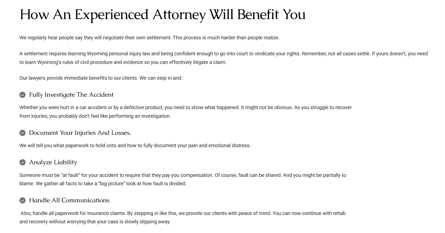
Freeburg Law, a firm handling personal injury and criminal defense cases in Wyoming, demonstrates this well.
Their Wyoming Personal Injury Lawyer page breaks down the entire case process step by step, from initial consultation through potential trial.
It lists specific questions visitors should ask any attorney they’re considering, like how many similar cases that lawyer has handled and how they typically communicate with clients. It even covers common mistakes people make after an injury, such as giving a recorded statement without legal counsel present.
This teaches visitors exactly what hiring a personal injury lawyer involves.
Give Visitors a Clear Route from Information to Human Help
Some situations are too personal, too urgent, or too tangled with individual details to resolve through content alone.
A visitor researching a legal issue, a health diagnosis, or a major financial decision often reaches a point where general information stops being enough. They need someone to look at their specific circumstances and tell them what applies to them.
Educational pages do a great job explaining concepts, but they can’t account for every variable in a person’s life. Customers respond better to digital information when they know they can shift to a real person the moment they need to. A visible, easy path to that person turns a helpful page into a complete resource instead of a dead end.
- Build this into your site by placing a contact option, chat feature, or phone number directly within or beside your educational content, not buried in a separate menu.
- Match the person offering help to the topic, whether that’s a specialist, an advisor, or a support agent.
- Make the invitation specific. Name who visitors will talk to and what that conversation will cover.
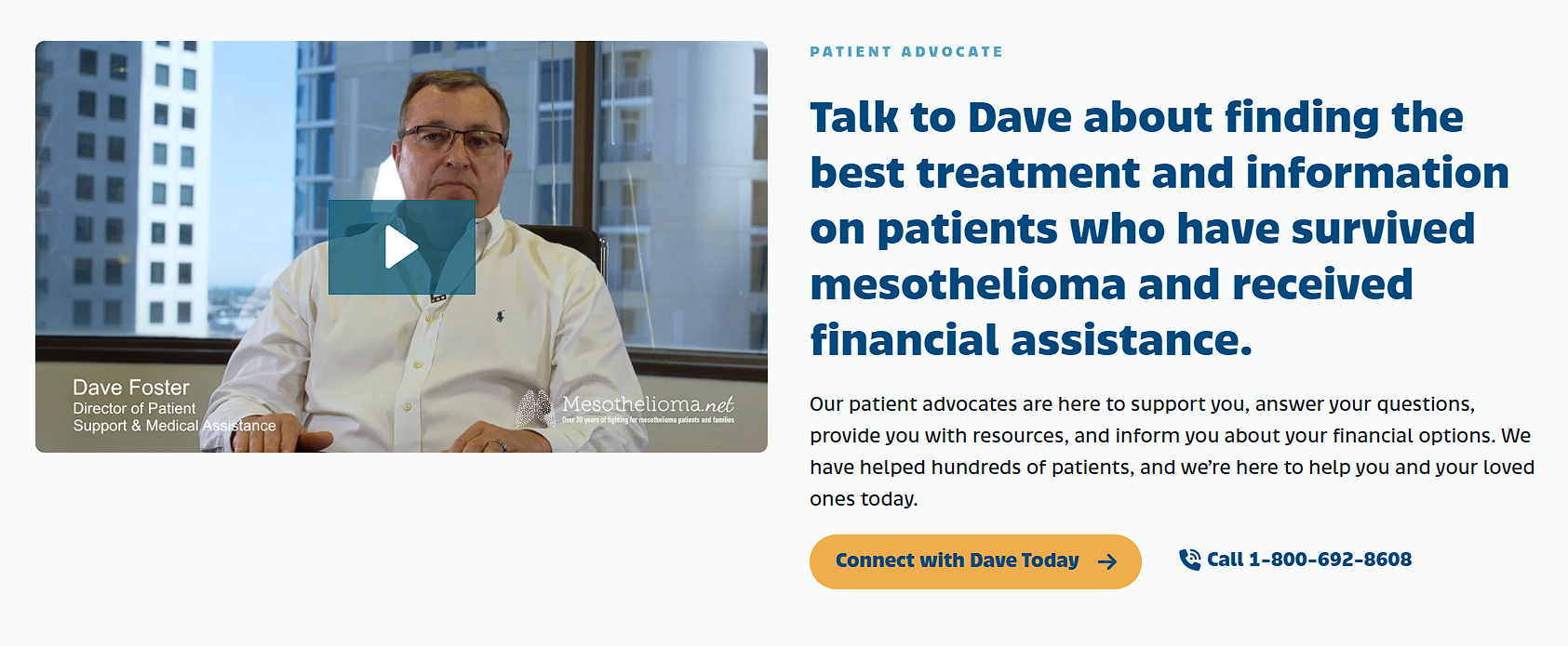
Mesothelioma.net, a resource site offering free information and support for people diagnosed with mesothelioma, builds this connection into its homepage.
Alongside its educational sections on treatment and diagnosis, the site features a patient advocate who visitors can reach directly for guidance on next steps. The page explains what the advocate helps with, from treatment options to financial assistance, and includes a direct way to start that conversation.
This allows visitors to move from reading about a frightening diagnosis to speaking with someone who can address their exact situation.
Include the Details Customers Need to Judge the Purchase
The main price tag rarely tells the full story. Buyers need to understand ongoing costs, restrictions, compatibility requirements, and other practical details that shape whether a purchase actually fits their situation.
A product page that stops at the headline price leaves customers to discover the real cost during checkout or, worse, after they’ve already committed. Roughly 40% of shoppers abandon their carts because of unexpected extra costs that surface late in the process.
Details like maintenance fees, usage limits, regional restrictions, or required add-ons belong on the page itself, not buried in fine print or left for a support call. When customers can see the complete financial and practical picture upfront, they trust the page more and back out less often.
- Map out every recurring cost, restriction, or dependency tied to your product or service.
- Then, build a dedicated section that lays them out plainly.
- Use tables or bullet points to make figures scannable rather than burying them in paragraphs.
- Update this information regularly, since fees and terms change, and outdated numbers erode trust fast.
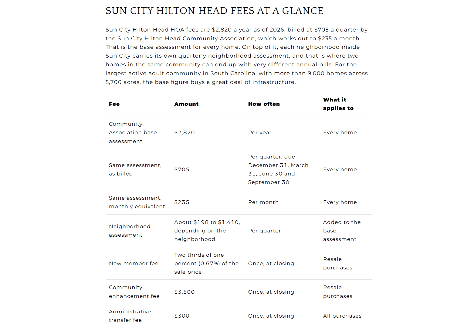
John Campbell, a real estate agent working the Hilton Head and Bluffton market, applies this approach on his Sun City Hilton Head neighborhood page.
Beyond describing the community’s amenities, the page breaks down the HOA structure in detail – the base annual assessment, the quarterly billing schedule, the added neighborhood-specific fees, and one-time closing costs like the community enhancement fee. It even flags that fees can rise over time and lists exactly what buyers should verify before making an offer.
This level of detail helps prospective buyers judge the true cost of homeownership before they contact an agent.
Create Resources People Have a Reason to Revisit
Most website content gets read once and forgotten. A different category of resource earns repeat visits, such as original research, benchmark data, regularly updated reports, indexes, and reference tools that stay useful long after the first read.
These resources work because they solve an ongoing problem instead of answering a single question. A one-time blog post explains a concept once. A living database or updated index gives people a reason to come back next month, and the next, because the information keeps evolving.
Publishing more articles adds volume, while publishing something distinctive, something no competitor has built, adds a destination.
- Look at the data your business already collects or could reasonably gather, whether that’s pricing trends, customer behavior, or industry benchmarks.
- Package it into a format visitors can scan quickly, like a dashboard, calculator, or recurring report.
- Commit to a real update schedule and stick to it, since a stale resource loses trust fast.
- Promote the resource as a standalone destination rather than folding it quietly into your blog archive.
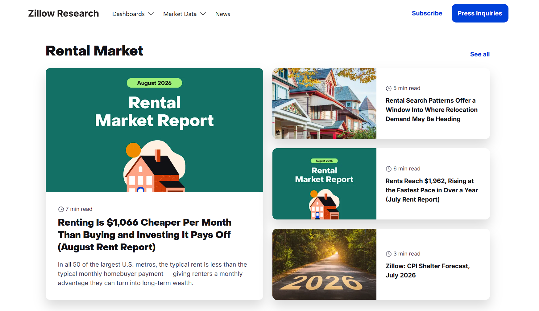
Zillow, an online marketplace for buying, selling, and renting homes, built its research hub around this exact idea.
The site publishes monthly market reports, rent trend data, and housing forecasts broken into categories like affordability, new construction, and rental trends. Visitors can explore an interactive market data explorer, download raw datasets, or read digestible summaries pulled straight from Zillow’s economists.
Zillow updates these numbers on a predictable schedule, so real estate professionals, journalists, and homebuyers return to the same pages repeatedly, treating Zillow’s research section as a recurring reference rather than a one-time read.
Final Thoughts
Your website can work harder with these five actions:
- Give visitors tools to act.
- Answer their questions.
- Show a clear path to human support.
- Reveal the details that shape a purchase.
- Build resources worth returning to.
Most business websites skip these steps because it takes more work than writing another paragraph. But those that implement them turn traffic into results.
Published: October 13, 2026