A mood board is a collection of ideas, thoughts, or concepts. It is composed of photos, videos and other pieces of information that are joined with a singled-out idea and express certain “vibes” or feelings that a maker experiences regarding the subject of a moodboard.
Moodboards have evolved notably over the past few years and replaced physical whiteboards with sticky notes and drawing pins. Today there’s a bundle of get-at-able digital products laid at designers’ feet: from a vector graphics editor and prototyping instrument for true professionals to an online mood board maker – for both aces and amateurs in the design.
Ones who take their first steps in mood board designs or just look for notions can search for ready-made templates, for example, a fashion or an interior moodboard. But it’s your pleasure from self-expression that counts, so why not start with a blank Weje canvas and unleash the imagination? Below are 7 tips that may help:
Decide on an overall concept
There are no strict rules concerning creativeness, and you can go many ways to collate a mood board. This may be made up of photos from your smartphone or camera, or those purchased from stock photography providers. You can choose to embellish a mood board with images and videos, or pictures only, or – enhance it with vector graphics objects, abstract paintings, pencil sketch drawings, GIFs, online photo enhancer and so on.
Moreover, moodboards shouldn’t necessarily be pic-only – you can enhance them with digital sticky notes, text citations, lists, and headlines. So, first, decide on what result you want to have, and only after proceed to further preparations.
💡Useful Tip 💡 Creating something from scratch is a challenging task, especially for those who have never sketched anything. To break the current stalemate, follow one of a “Steal Like an Artist” book’s suggestions, that is – to search for inspiration in what someone has already created before. In particular, you can refer to Pinterest, Dribbble, or Behance, find mood boards that catch your attention, outline their common features, and try to recreate them.

Start with text notes or “scenario”
Think about what mood you want to create? Write down the very first words that come to mind, e.g. “old-word, faded poster, light-toned, vintage, wooden window frame” or “breeze, navy, marine, shell, whitewashed wall”. Don’t chase much meaning – concentrate on the atmosphere. After, use these “codewords” to search for pictures by hashtags.
Cast around photo stocks
Google photos are good to refer to, but there are 2 issues with them: low quality and copyright. Luckily, there are many platforms where you can purchase HD photos or drawings – at a pretty moderate price. Consider these well-known stocks to start with:
- Shutterstock – here you can purchase photos, videos, images, vectors, and even music; you can also explore a library of royalty-free images or download a preview object (that contains a watermark) and see if it fits your design, before paying money.
- Depositphotos – this stock is convenient for entrepreneurs or marketers because all photos are grouped by topics and have a self-explanatory title, say, “Asian woman mature adult eating bread carbohydrates”.
“An example of how you can search for images and see preview on photo stocks”, source
Once you’ve opened a photo preview, Depositphotos will suggest dozens of similar images with slightly different angles of focus, color temperature, saturation, etc. So the limit for one’s inspiration is boundless.
- iStockphoto – sells HD photos that can be used for either personal or commercial purposes; by the way, you can save purchased images on boards in your profile and preview how they will look in different combinations.
Although 10-20 bucks for a photo isn’t an immense price, if you make a mood board for sole use, say, to plan a future trip or a flat design, paying money for references doesn’t make much sense. We suggest you use stocks that offer royalty-free images, like Pexels or Unsplash. Here, the choice will be smaller, but you can still find 5-10 good options for pretty much every life occasion.
💡Useful Tip 💡 When you create a mood board, you never know which picture may be needed, so don’t hurry up to discard images. Instead, create a blank Weje canvas and upload there everything you’ve saved previously from the Web or just drag & drop links to images. Take time for a photo-hunting, for example, a few hours or days, if you do a complex design project. After everything is on canvas, you will see a big picture and can start with the initial grouping.
Experiment with fonts and background
You will be surprised to see how differently your mood board will appear with a new font or canvas color. To come up with the best mood board version – try out several.
As for canvas, in most cases, it’s better to choose neutral or pastel colors – all shades of pink, beige, and grey, minty, sea green, light steel blue, light coral, and violet. Especially if your moodboard contains emotional or kaleidoscopic pictures. For more ideas about colors and shades, check out Pantone Color Systems.
As for fonts, don’t reinvent the wheel and simply start with the highly-rated ones. According to 99designs.com, these are:
- Futura
- Helvetica
- Verdana
- Mrs Eaves
- Baskerville
- Uni Sans
- Clarendon
- Frutiger
- Proxima Nova.
Use animation
Static mood boards are not as expressive as dynamic ones. To better show what you think and feel, add a video, a GIF, or some music to the prototype. This may give you an idea on how to finalize the moodboard and you then can show this reference to a creative agency – to order some unique or customized piece of animation or sound.
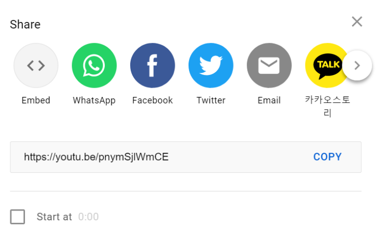
💡Useful Tip 💡 You can embed videos from YouTube directly on a Weje board. To do so, press “Share” near the video, copy the link, or choose to embed.

source: YouTube
Organize objects
After you’ve collected photos, pieces of content, proper music, and/or video, you need to group all these in an allied object. There isn’t one practical advice on how to put elements together, because their size, shape, and rotation are “raisins” of a mood board that make it unique. Nevertheless, you may follow these general proportion principles:
- make elements that you want to emphasize larger, compared to other objects in a composition
- where relevant, use an equal division of space – to achieve a harmonized proportion
“Even for very customized mood boards, it’s better to stick to good proportions”, source
- place elements together, according to their similarity
- create a dynamic design – avoid placing objects in a simple order, say, 3 rectangles that follow one another
- combine both major and minor areas of a space.
Collaborate & seek for feedback
If you create an on-demand moodboard, for example, an interior prototype or a guideline on how clothes should be put on store’s hangers, it’s very important to align creative efforts with the team and get timely approvals and comments from the client. A good idea is to apply one of the software development principles, that is – version control. When the very first prototype is ready, agree on this with all stakeholders, but don’t make edits directly in the file, so that you can restore the original at any time. Instead, proceed with versions #2,3,4, and so on.
💡Useful Tip 💡 Weje allows sharing the workspace effortlessly – within either in-house teammates or any external parties. All you need to do is to invite a person via email so that he or she will have access to the project. Or – create and copy a shareable link to your workspace, and message it to your peers. After the moodboard is ready, you can download it or present it to the world via social media.
Creating a mood board is an enjoyable process. Time, inspiration, and a convenient digital tool to work in – these are pretty much all you need to have to start.
Published: July 18, 2021


